Linear Navigation
If you'd like to learn more, please get in touch.
Context
When Apple introduced a new design system in iOS 26, it was a natural moment to step back and rethink navigation as the app was structured around an older bottom toolbar pattern that no longer felt at cohesive.
Problem and opportunity
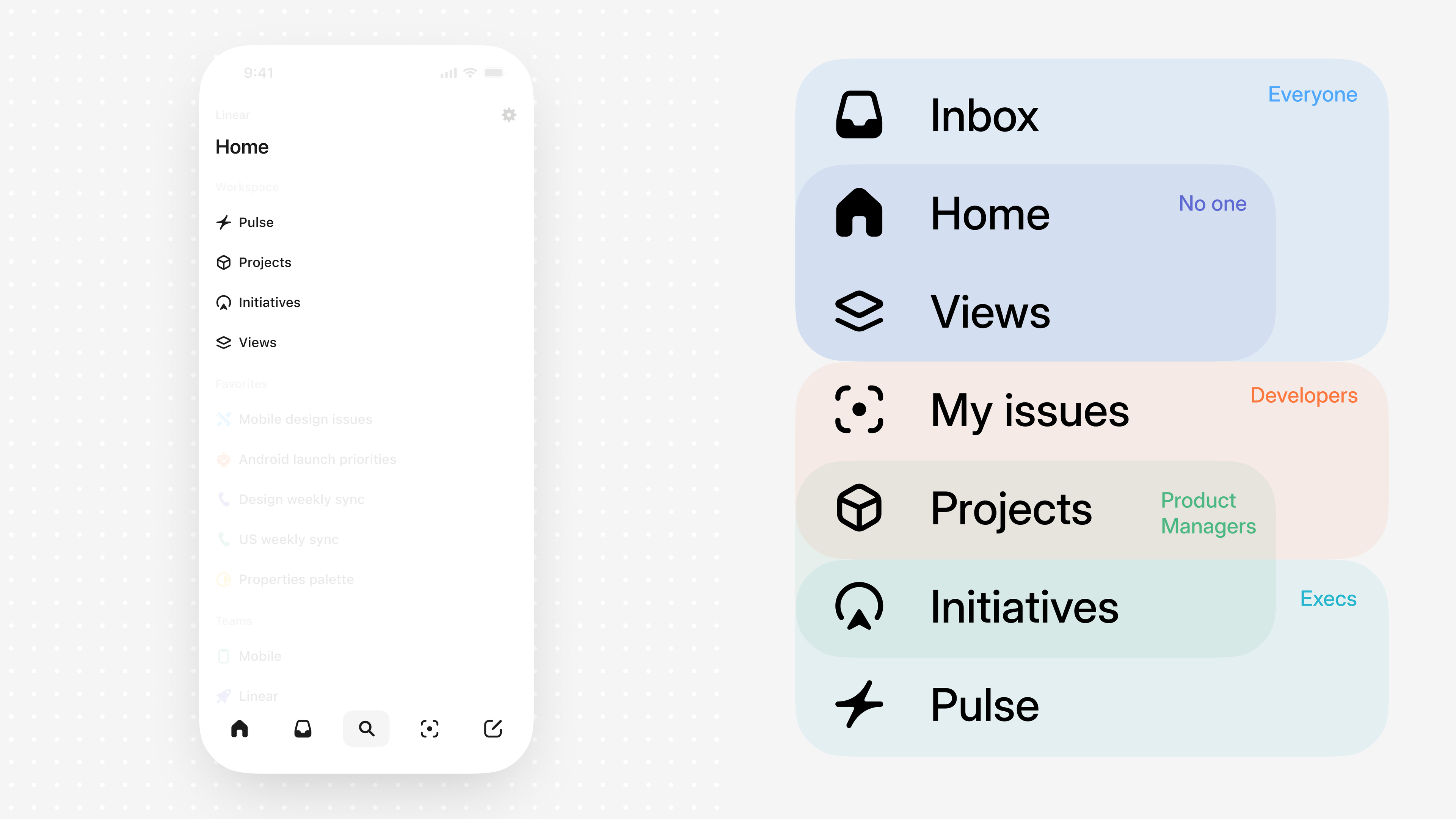
As Linear Mobile's surface area grew, new problems started to show up. The architecture offered broad but generic access to the feature set, while different personas relied on very different parts of the app to get their job done.Navigation centered on branches off a single Home tab, which made the app usable for everyone but didn't make it feel tailored to anyone in particular.With the opportunity to rethink navigation holistically, we could evolve Linear Mobile from broadly usable to truly purpose-built by shaping the experience around each role's needs, delivering sharper focus, less friction, and a deeper sense of fit.
Solution
I came back to a familiar pattern that could scale with Linear's growing complexity, the tab bar. My goal was to create an experience that feels familiar but powerful, with functionality and interactions that reveal themselves through natural exploration and feel obvious in hindsight.To give the tab bar flexibility and make it more relevant to your specific role, I made the fourth position dynamic. Tapping the chevron expands the bar to reveal additional tabs with clear labels. From there, you can reorder the tabs so your core workflow sits front and center.The tab bar collapses when needed, but is always within reach, so you can move through the app quickly while keeping your most important areas of Linear close by.
Details
I think it's important, when you're shipping something new like this, to do so with a lot of care and attention to interaction and visual design. My job was to make the extension to the tab bar feel valuable and exciting on the very first use—natural, expected, and intentional—so opening the menu multiple times per session feels effortless.To design it, I built a SwiftUI playground that exposed animation variables so I could tune the transition in context.
The transition uses an arc animation that compresses on initial tap before springing open for a bit of dynamism and physicality. To stay cohesive with the motion of the container, the content moves upward with a small stagger and a touch of bounciness.
The tab bar is spring-loaded, so you can open the menu and change your tab selection in one fluid touch-drag-release gesture—and for added ergonomics, you can also open it with a swipe.
When you select a tab from the menu, we display its icon next to a minimized chevron in the tab bar to help you keep your sense of place.
Liquid Glass icon
I wrapped up this work by crafting a new app icon designed to support the Liquid Glass design language across light, dark, clear, and tinted modes.