Context
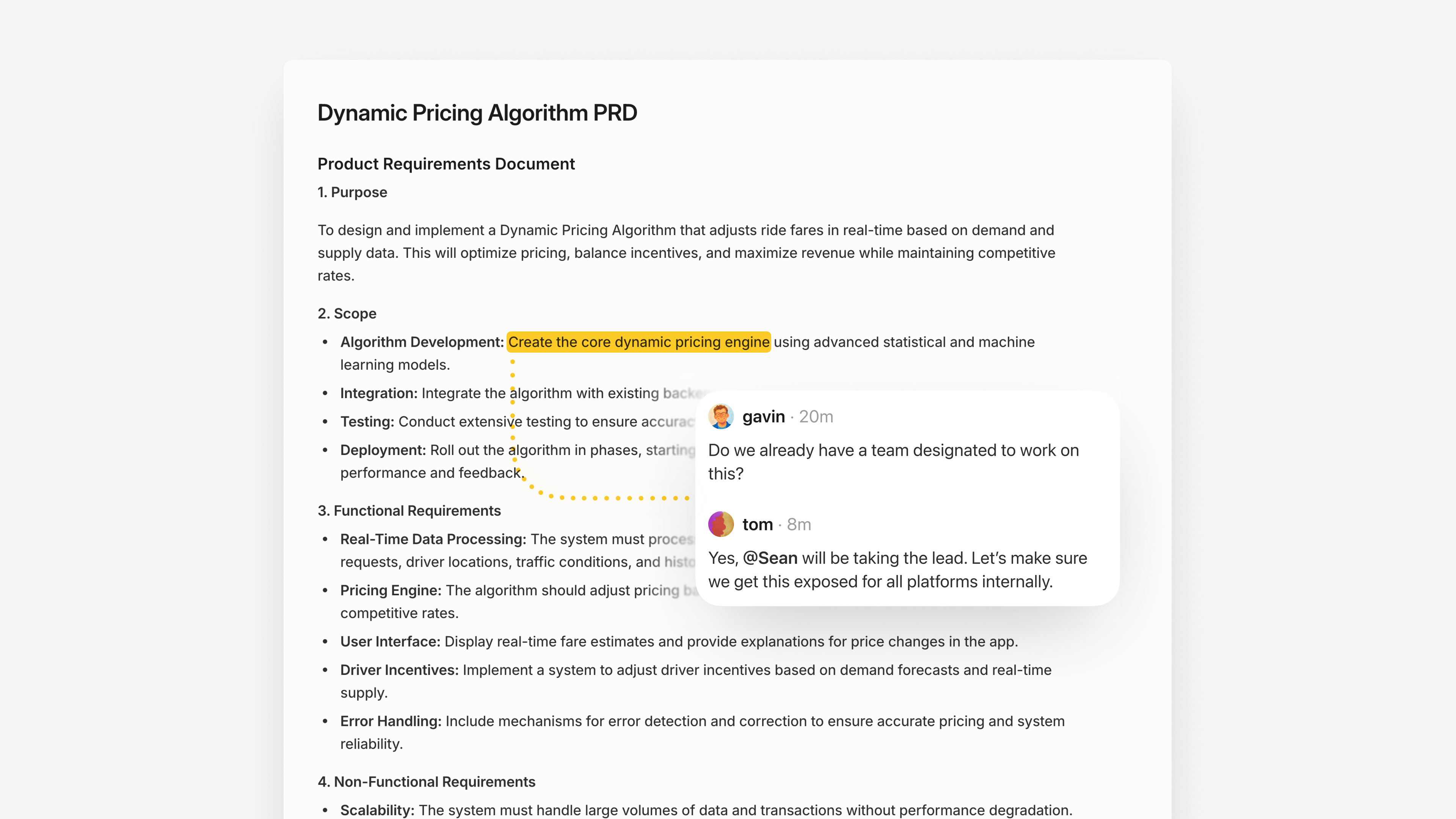
Project documents are a key collaboration surface in Linear. They support rich text, synchronous editing, and inline comments anchored to highlighted text ranges. These comments are central to how teams work together: a single comment can grow into a thread as replies are added, and each new message notifies participants so everyone stays in the loop.

Problem and opportunity
When documents shipped on desktop, document comments immediately started generating notifications on mobile, but you couldn't open the document or read the thread itself. You knew something happened, but you couldn't actually see or respond to it.Linear Mobile focuses on being a great communication tool for on-the-go inbox triage and discussion participation. As document notifications ramped up, it became clear that not supporting documents on mobile was breaking a core feedback loop.
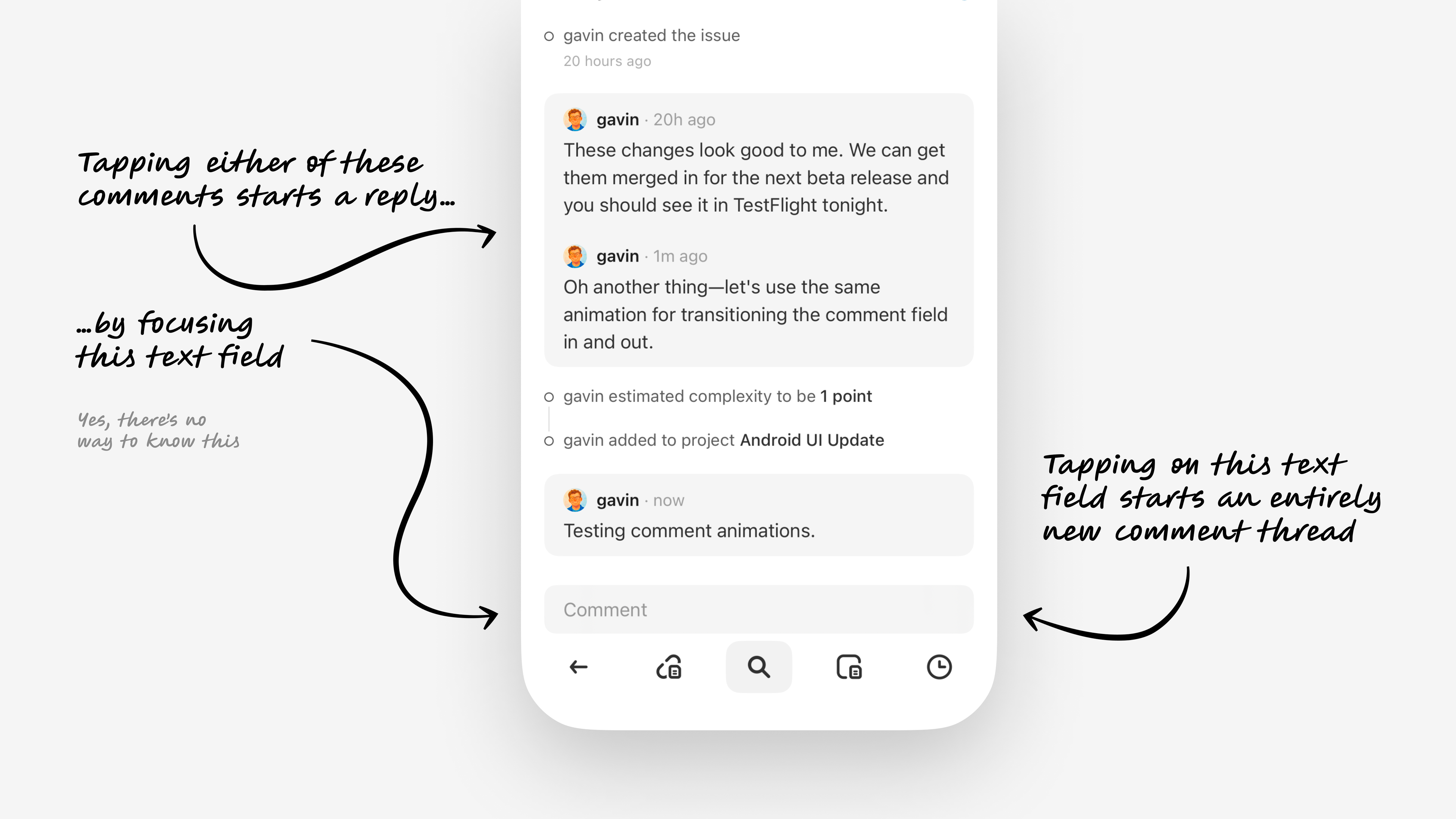
At the same time, the commenting model on Linear Mobile was already showing its seams. New comments and replies all went through a single shared composer at the bottom of the screen.That setup made reply behavior ambiguous, introduced complexity users shouldn't have to manage, and didn't map well to document comments that need to be linked to a highlighted range in the doc.To stay true to our goal of making Linear Mobile a great place for team communication, we used the documents work as a chance to redesign commenting into a unified system that could scale.

Scope
To deliver value quickly, the team decided to prioritize smallest feature set that would meaningfully support documents on mobile: reading docs and responding to existing comment threads.That was enough to unblock the core communication workflow and add value before we could prioritize a full document creation and editing experience.
Goal
Competitive analysis showed a fairly "obvious" pattern for documents on mobile. You show rich text in a scroll view, mark commented ranges with a highlight or icon, and open a modal with the thread when you tap a range.It works, but I've always felt it had some friction. Once a doc has a few active threads, you end up constantly tapping, opening a sheet, closing it, and repeating just to catch up.My goal was to see if we could address that friction while keeping the document experience familiar enough that existing mental models transfer right over.
Solution
Documents open in a familiar format with rich text and inline highlights. Tapping on a highlight opens a sheet that pulls every thread into a single list, so you can skim what's new and reply without bouncing in and out of separate modals.To give each thread relevant context and spatial bearing, the sheet allows some of the document to peek through. As you scroll through threads, the underlying document scrolls in sync to the right highlight, so each conversation is always anchored to its place in the text.A drag handle allows you to peek at more context if you need, and if you scroll the document itself, the sheet collapses to let you read freely.The end result feels natural. The experience behaves like a familiar comments sheet, but with a small extension that reveals itself through normal gestures instead of a new "mode" or pattern to learn.
Unified commenting model
Comments now follow one simple model across issues, documents, and project updates. Each thread has a clear reply action with a composer that appears directly under it, so it's always obvious what you're responding to.By replacing the shared global composer with these inline reply actions, the experience becomes more predictable, scales to documents, and removes the mental overhead of wondering where a comment will end up.
Prototyping
Both of these new systems only came together by working through the decisions in high-fidelity prototypes. I tried many variations of each, catching behaviors that sounded good on paper but felt off in practice, and surfacing new details to refine.Together, the new documents view and unified commenting model turned document notifications into a workflow you can actually finish on your phone, instead of a reminder to "open this later on desktop."