
Linear homepage renders
3D rendering
Linear recently launched a new homepage to showcase the product and the care that the team puts into crafting it. I was able to contribute a small part to this page by creating two renders of our product's interface. Below is a walkthrough of some of my thought process and unscientific methods while creating them.
Background
The Magic Team (website + brand) at Linear had been exploring various visual styles for graphic assets on the homepage and were drawn to a skewed perspective style incorporating depth and glass-like materials. Edgar worked some magic in Figma for many of the small assets you see on the page, but the team was also interested in exploring some 3D interface representations using physically based materials and lighting, similar to a render of the Linear app icon I previously created.
Process
When it comes to the visual aspects of design, the framework I believe in is applying taste and collaboration to extensive iteration. For me, this often manifests as a cyclical process of analyzing my work, figuring out what parts could be improved, tweaking a value slightly, and comparing the new version to the old.
To get started, I created a scene to experiment with materials and lighting. Here is the first render I produced, with annotations of what was working and what wasn't, both from my analysis and feedback. This early iteration was more about the overall feel than anything scientific.
Creating this first test render was primarily about giving myself and the team the confidence that the "let's render some assets in 3D" idea could actually amount to something. After gaining confidence in the idea and hearing some promising initial impressions, I wanted to focus on honing in on a style that could act as a foundation.
Going back to the framework I outlined earlier—apply taste and collaboration to iteration—this point in my experiments more or less marked one full cycle. The mindset you need however for the framework to be successful, is a willingness to just keep iterating, being critical, and making adjustments to improve your work. The above render was a start, but it didn't quite fit in with Edgar's existing graphics and wasn't up to my personal standards.
Credit: Edgar Ambartsoumian
To streamline my cycles and be able to quickly understand how adjustments I made affected the render, I created a scene with fewer moving pieces, similar to setting up a minimal reproducible example when debugging code.
My goal with the 50ms scene was to experiment with elements like the light reflections off the background surface, the roughness of the glass texture, and the atmospheric lighting (and also to collaborate with Maya on bringing elements into a live canvas via Three.js. Maybe something you'll see from Linear in the future?).
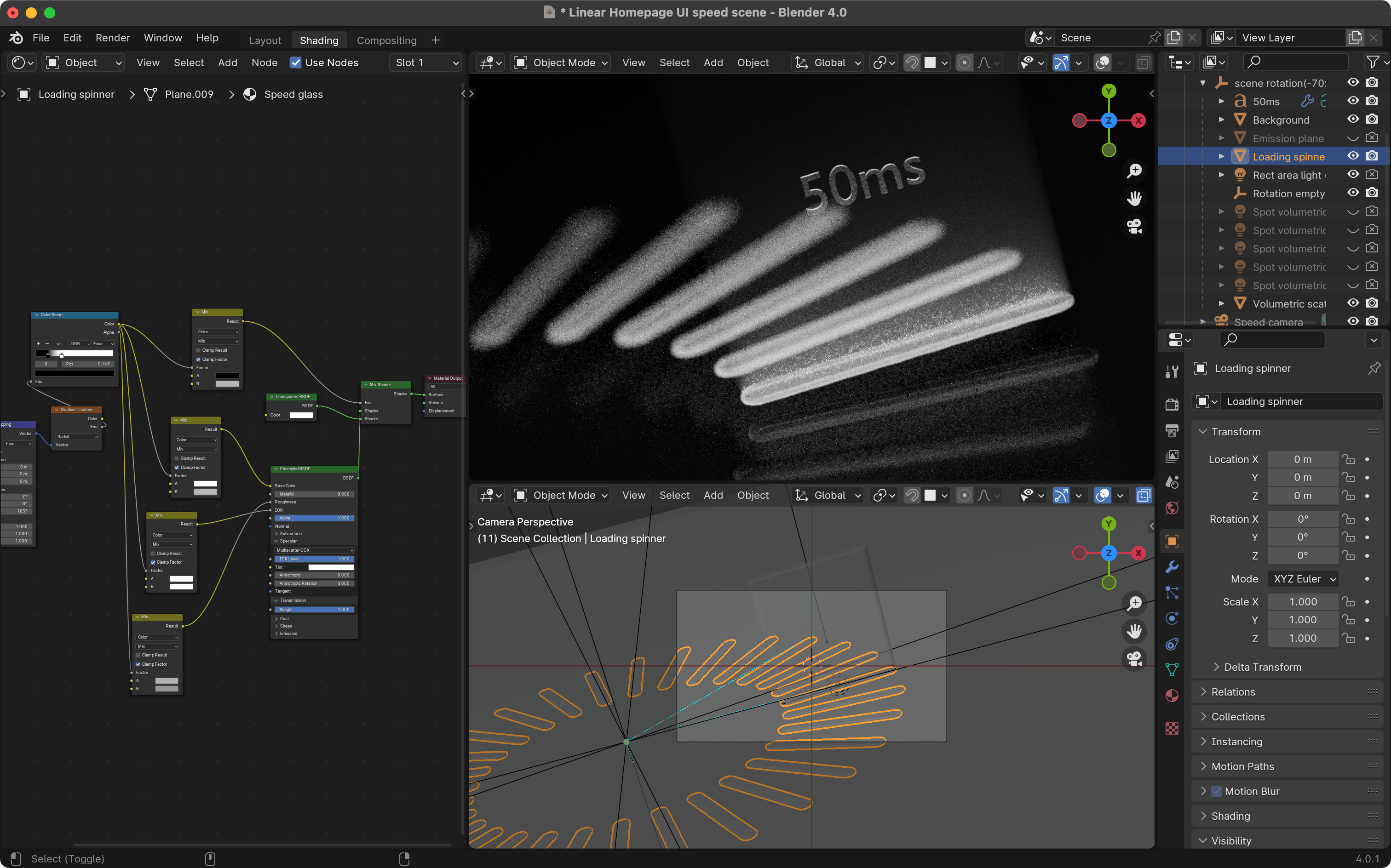
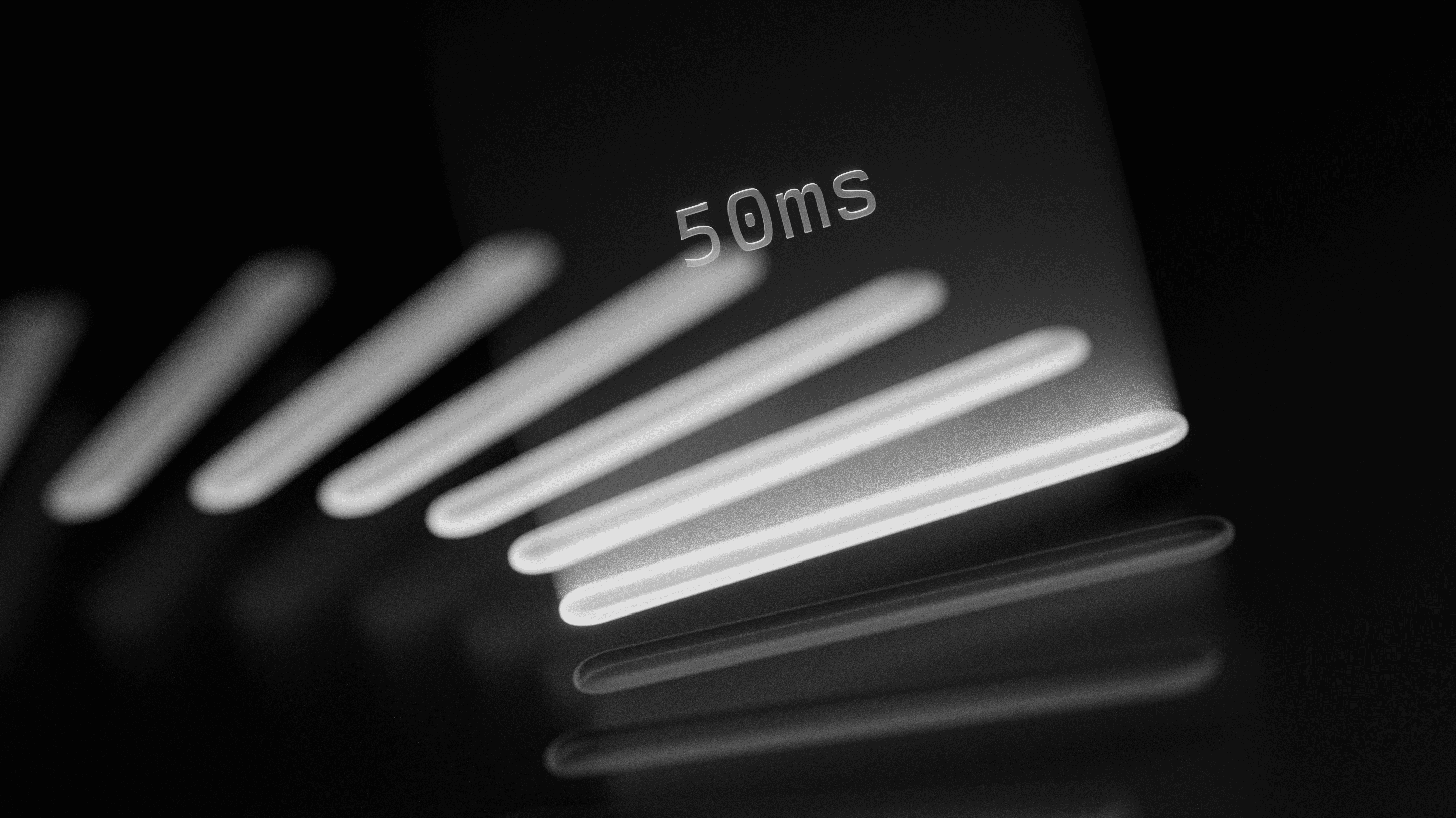
We ended up not using this scene in the final homepage, but I learned how to capture elements of the aesthetic we were after:
- Volumetric lighting (think, visible hazy rays of light), more explicitly used here, created a really nice atmosphere that fit in with a lot of the aesthetic of the rest of the landing page.
- Rough glass with an index of refraction that was not actually physically realistic was working nicely as a way to highlight the edges and give them more contrast against the background by changing the angle that light bends as it enters the glass.
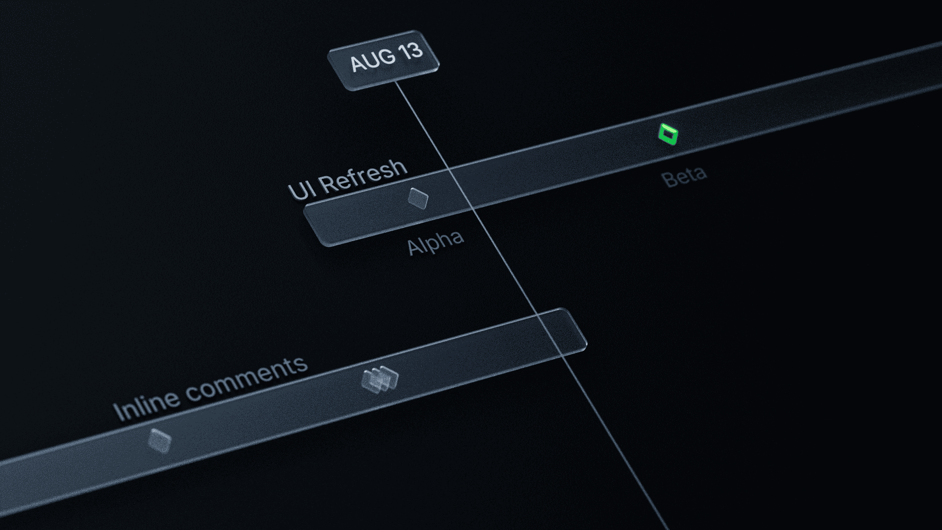
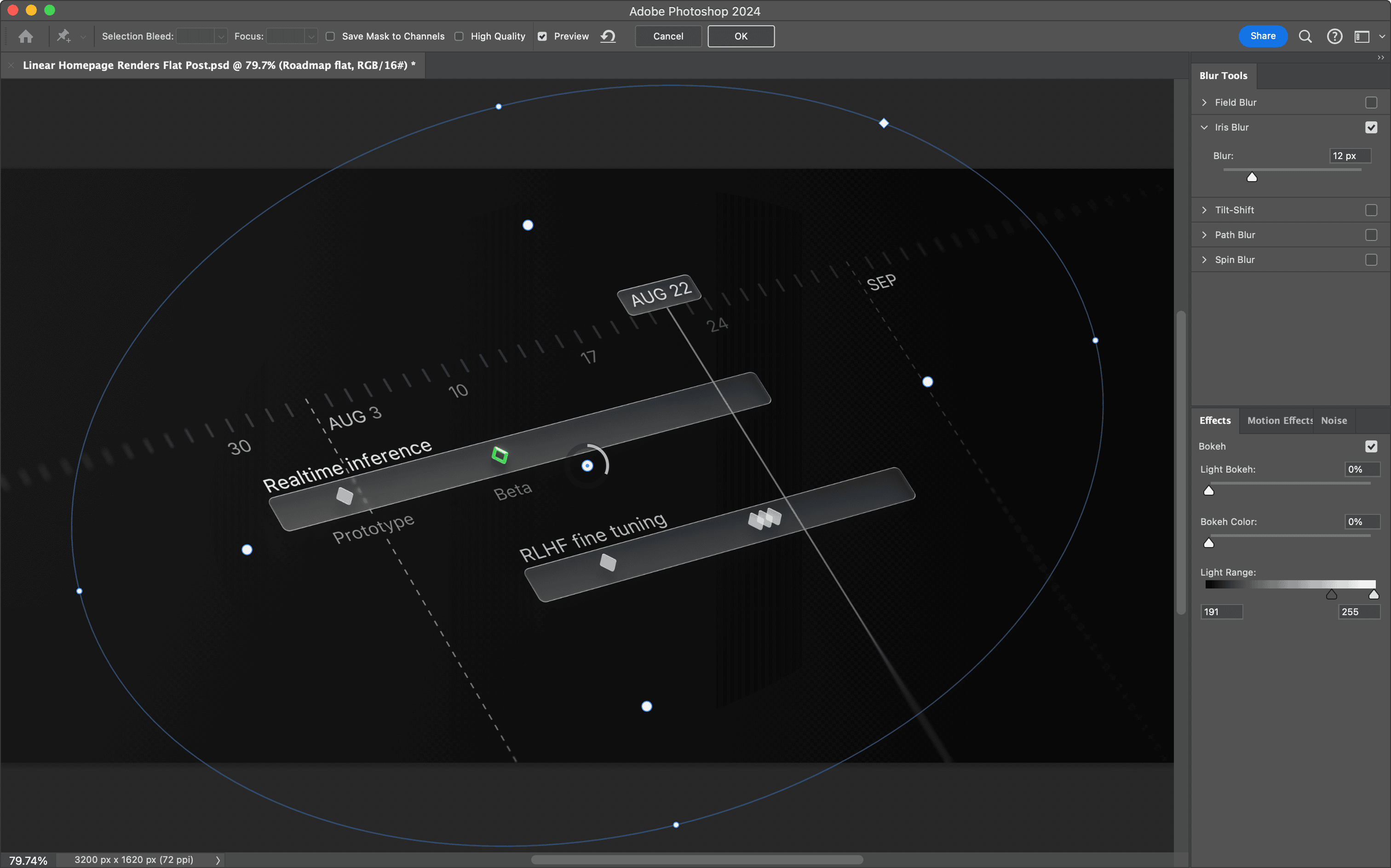
- The background reflections significantly depended on the content it was reflecting. They worked nicely in the 50ms scene, but in the Roadmap scene with smaller details, looked much too busy. Below you can see an example where the reflections draw too much attention and make text very hard to read.
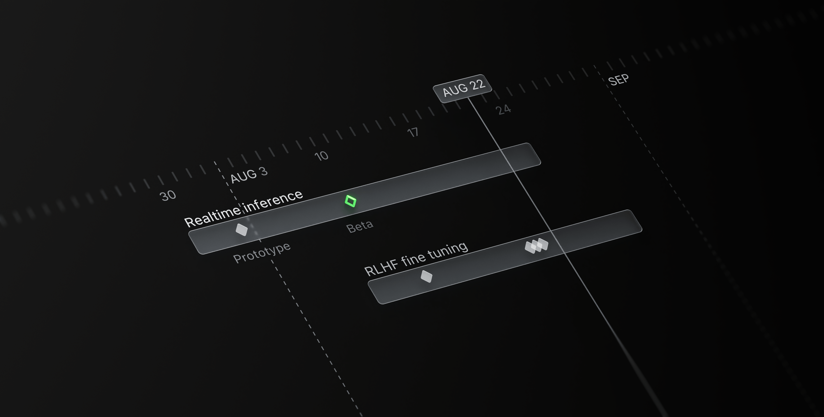
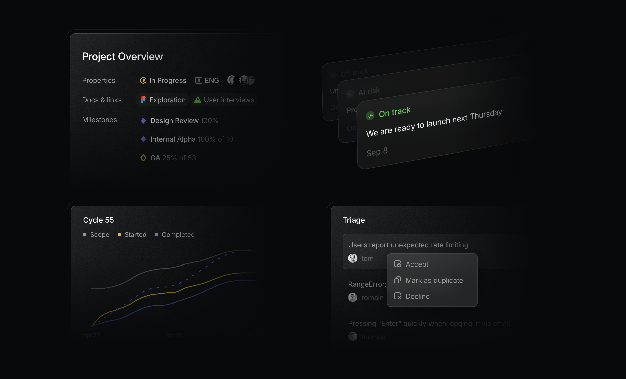
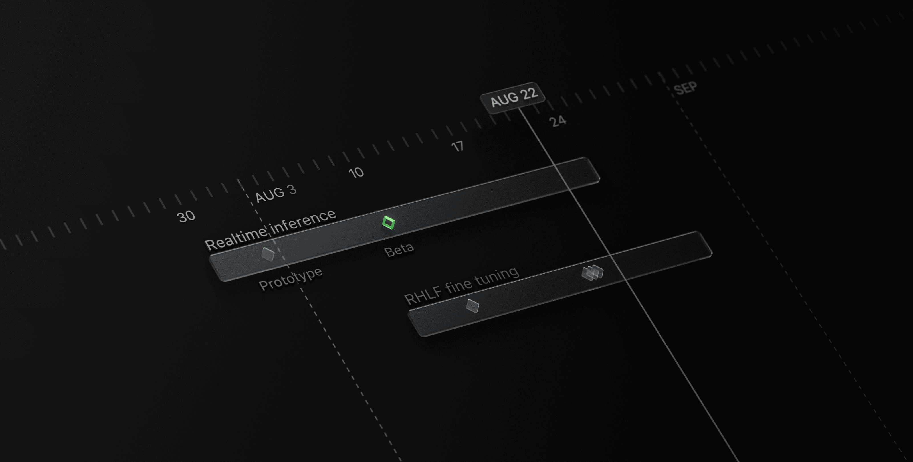
With these new notes on what was working and what wasn't, I started reworking the shaders on the Roadmap scene, and started explorations on a new Issues scene annotated below.
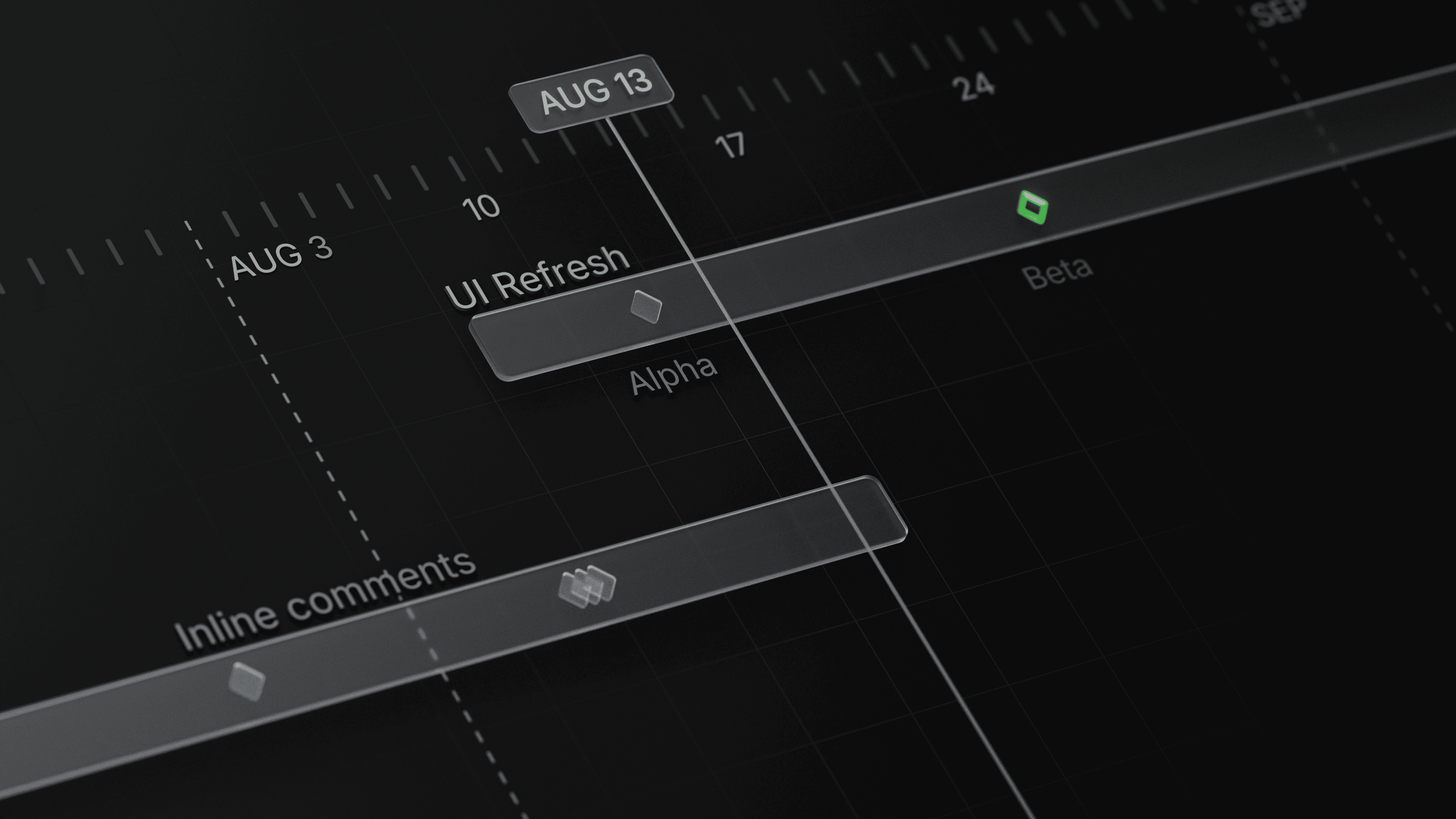
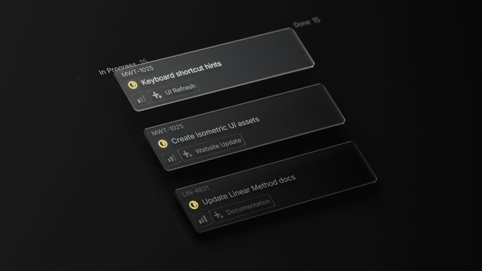
Again, a lot of my iterations here were "guess and check" where I'd make mental annotations like the ones you see above, start tweaking values, and comparing the output to the previous version.
For example, the third issue in the board view above was looking much too dark to my eye. It should be darker given it's lower to the surface and not as primary, but I learned that adjusting the lightness value of the glass material I was using for it was creating something closer to black glass, rather than a more translucent look.
Instead, by lowering the alpha (transparency) of the material, I could fade the issue into the background more, and decrease the shadow it cast. Then it was just a matter of trying a bunch of different alpha values and seeing which one I liked the best.
A quick note on tools
The tools I use are simply a means to an end. If you're a Blender / 3D expert, you might be thinking "adjusting the alpha of a shader isn't physically accurate" or "using an IOR of 1.17 for glass is incorrect." Or even "this could be a lot simpler in After Effects." When my goal is to create an image artifact that can be used on our website, I was happy to make physically inaccurate adjustments or turn to a tool that I knew how to use effectively to get the job done.
More cycles
I won't go into the technical details of every adjustment I made, but my process looked very similar across the whole scene:
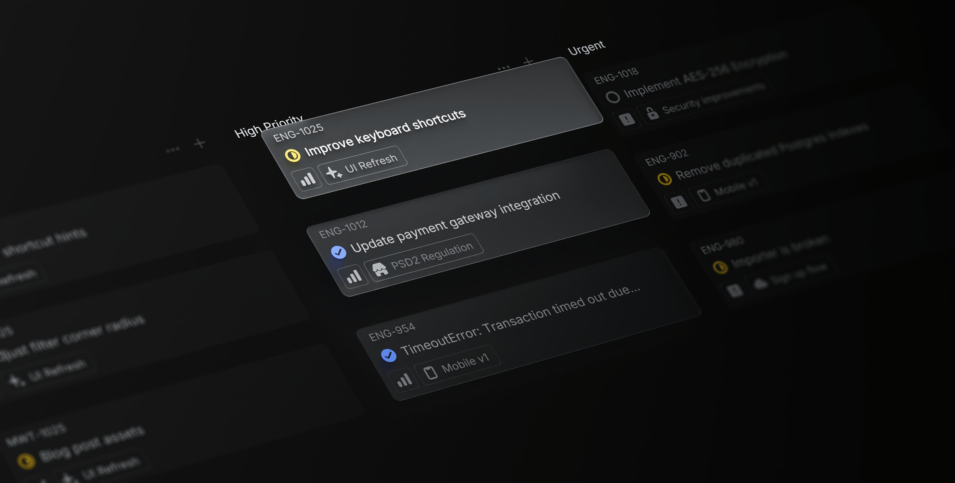
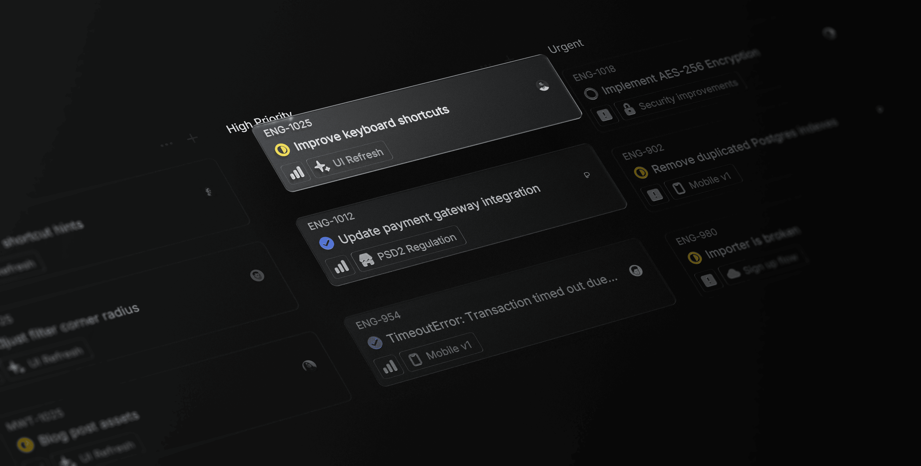
- The outline style for the secondary issues was looking a bit off and distracting so I iterated through a few different ways of rendering them and ended up on a very subtle filled version.
- The glass elements took a lot of adjusting to get the right mix of brightness and translucency.
- Julius pointed out that the avatars were a bit distracting and looked out of place given their lack of depth and translucency.
- The brightness of the secondary icons went through a lot of adjusting. I made a bunch of different versions of the typically orange "urgent" priority icon seen in the background to find the right level of attention grabbing.
- There was some pretty significant gradient banding caused by the subtle light glow on the background that I wanted to reduce as much as I could. Through my adjustment iterations I found I could cut almost all of the banding out by introducing 2% monochrome, gaussian noise at 50% gray, set to overlay.
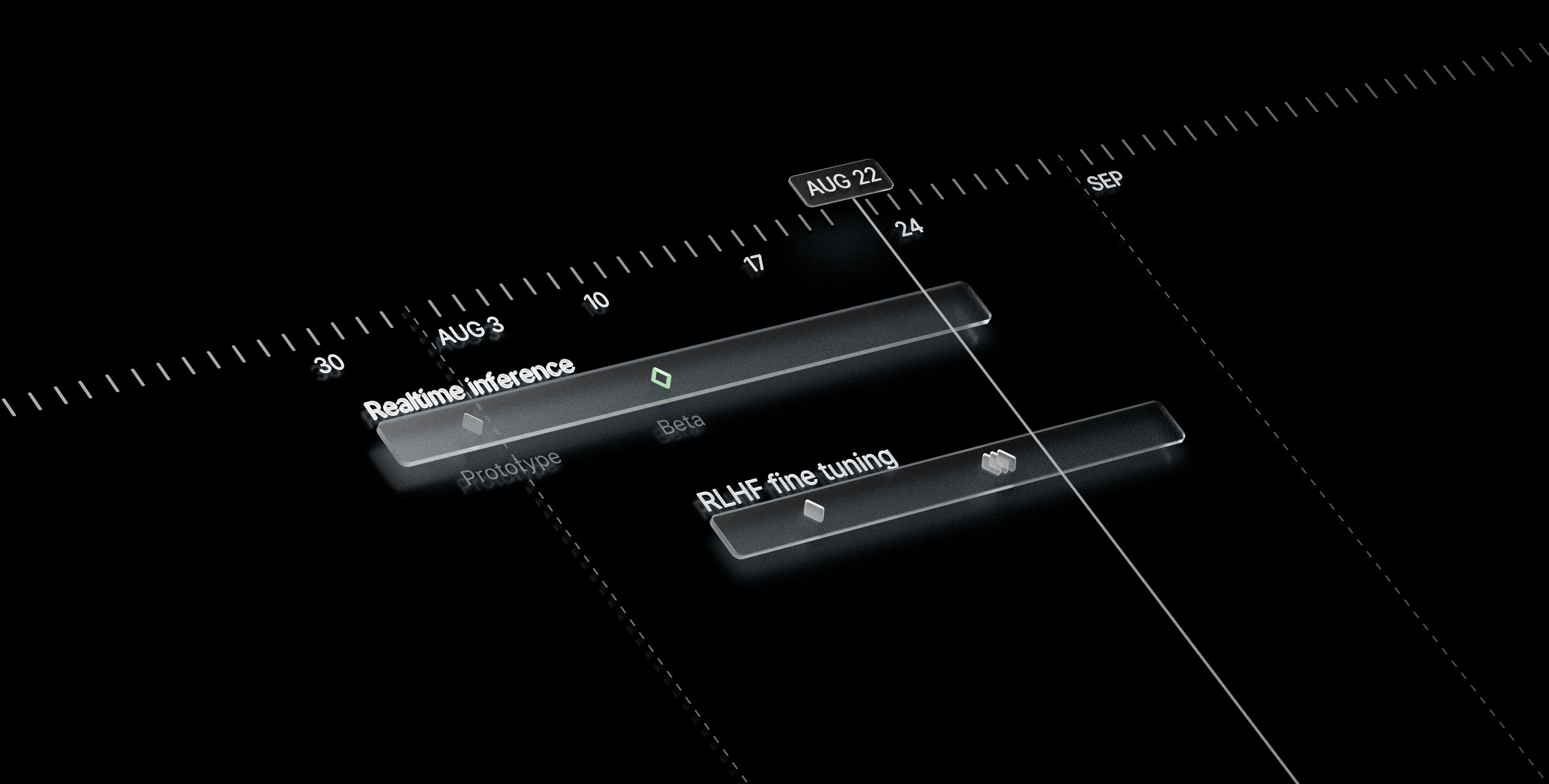
- Karri noted that the important parts of the render, notably the "Improve keyboard shortcuts" title and "AUG 22" date were not fully in focus and created too much light bloom so I spent a lot of time tweaking the camera aperture (and eventually removed depth of field entirely) and adjusting the glare that was being added in post compositing.
It's details like these that might not directly negatively impact landing page metrics, but they do collectively add to the impression of the quality of a product and the care that goes into creating it. Even if only 0.1% notice these imperfections, I—and I'm guessing the rest of the Linear team would agree—can't sleep well knowing they're there.
I eventually wound up reworking a lot of the meshes to make them sharper and more true to our product's interface and doing the depth-of-field blurring in Photoshop to have finer control over the focus of the image.
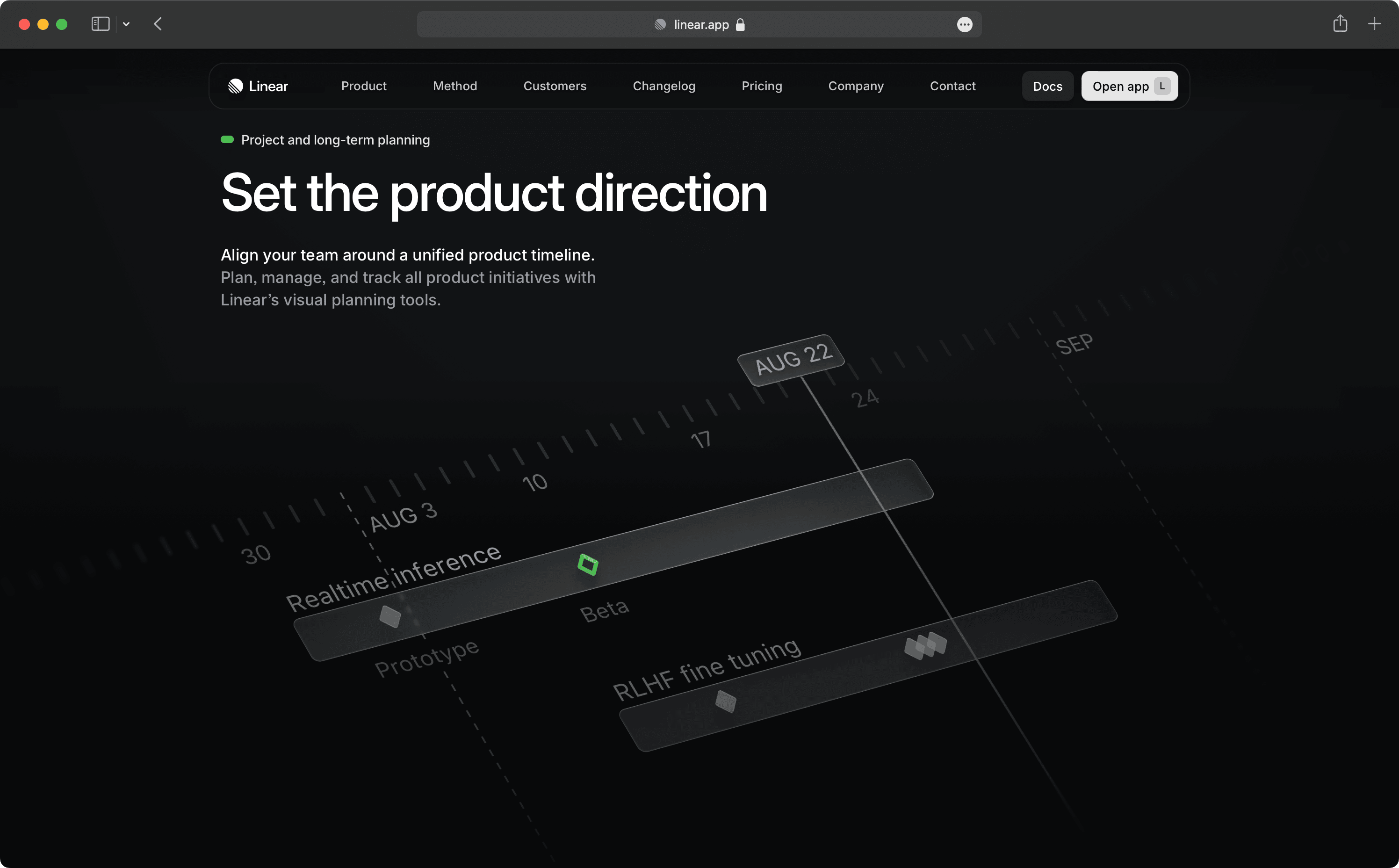
Flattening the meshes out a bit proved to be the real key to give the renders more of a subtle feel that worked better in the context of the page. It brought them more in line stylistically with the other spot illustrations and I felt they better represented our product.
To see the rest of the fantastic work and care the Linear team (shoutout to Paco, Julian, and Edgar) put into crafting the new page, head to http://linear.app/homepage.
Thanks to Julius for encouraging me to write this up and offering feedback on earlier drafts.