Linear Search
If you'd like to learn more, please get in touch.
Context
Linear Mobile started with an unconventional bottom toolbar. At the root level it showed navigation tabs and a "new issue" action, but as soon as you drilled in to the push navigation hierarchy, it transformed to only show view specific actions and a back navigation button.This model worked well when the app's hierarchy was shallow, but as the product grew problems started to show up.
Problem
This pattern of hiding the navigation tabs meant there was no truly fast way to jump across sections of the app, and no lightweight multitasking between different views.You ended up repeatedly backtracking through screens instead of being able to jump across sections of your workspace to traverse the hierarchy quickly.
Scope
The team wanted to avoid completely redesigning the bottom toolbar navigation, so I focused on reducing the worst navigation pain within the existing architecture.My goal was to keep the bottom toolbar intact while making it feel almost frictionless to move around your workspace from mobile.
Exploration
As I explored options, I collaborated with the desktop team as they built a new semantic search engine powered by vector embeddings to shape it into a universal entry point on mobile.Universally accessible search became the way to easily jump to any issue, project, or list from anywhere in the app, without taking on a full navigation rewrite.

Solution
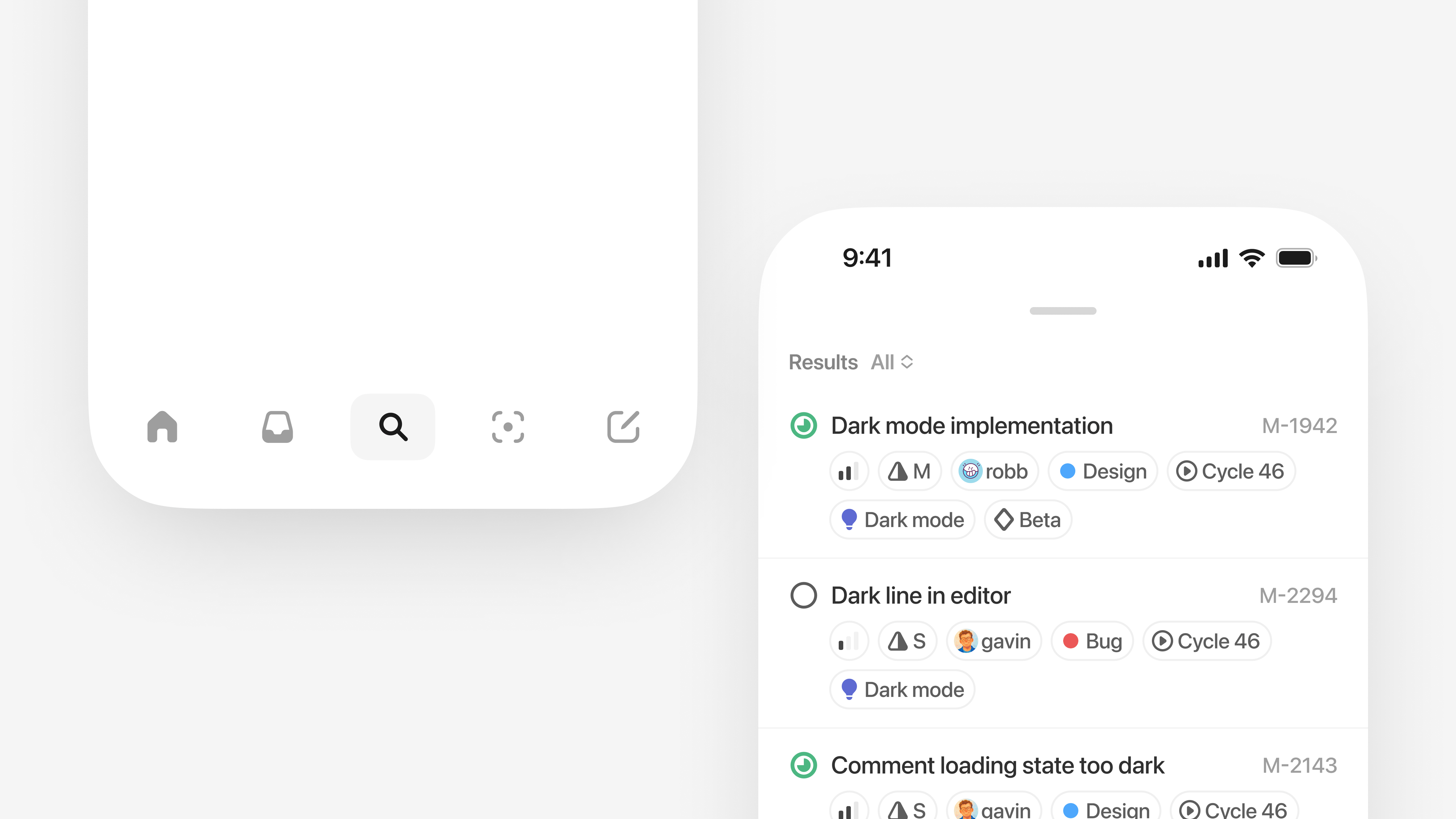
I landed on introducing a persistent search control in the bottom toolbar that you can invoke from anywhere in the app. Tapping it opens a lightweight overlay that surfaces recently viewed items and common destinations, then filters them instantly as you type.When you submit a query, the new semantic embeddings engine takes over to search across your entire workspace.This turned search into a universal jump point so you can quickly move between distant parts of Linear without backtracking through navigation hierarchies.
Display options
To make results easier to scan, I designed a system to show a flexible set of display options that we then rolled out across the app.You can choose to see just the metadata you care about, so each result has your preferred amount of context to make it recognizable at a glance.
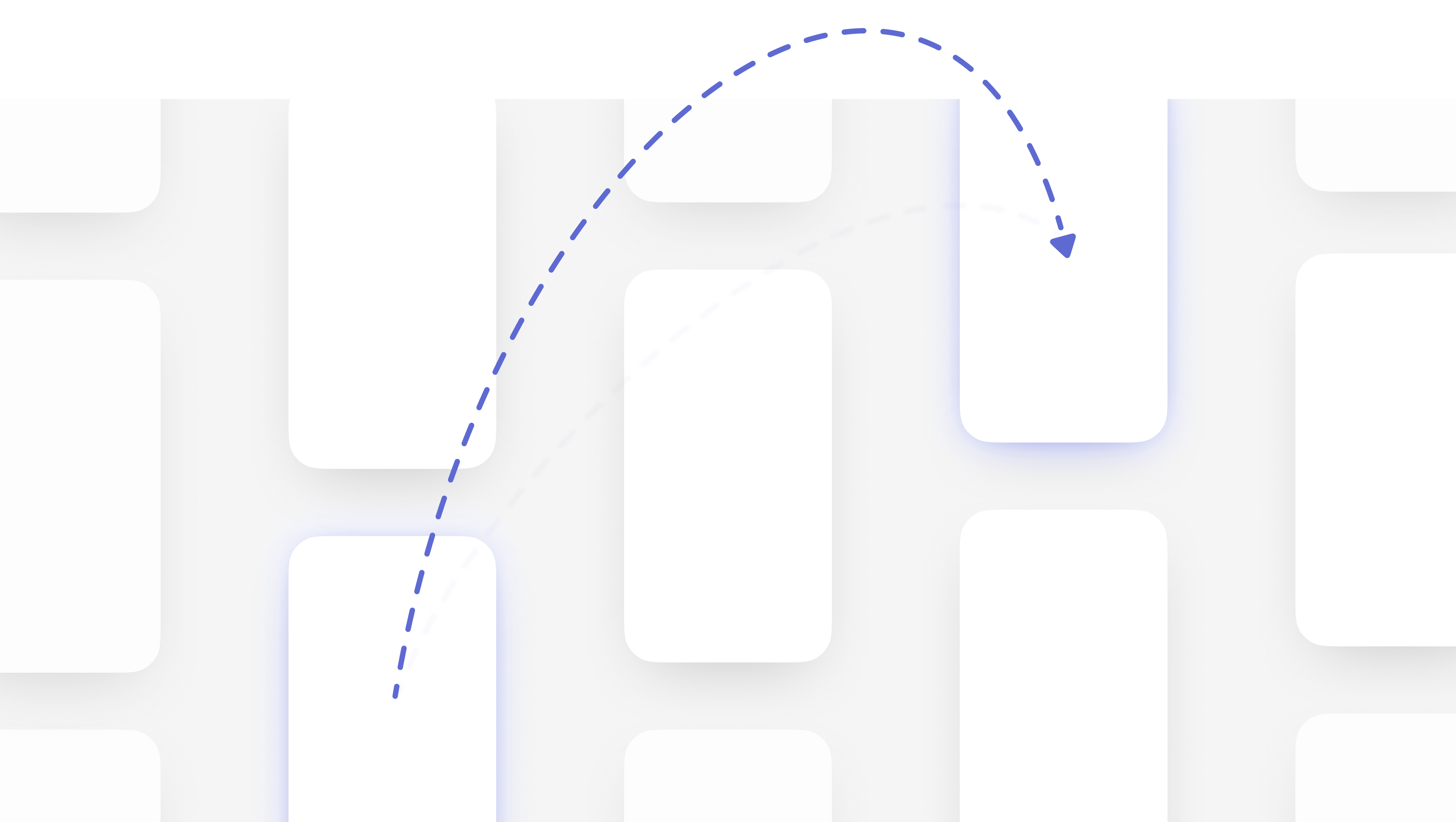
To make the experience feel fluid, I treated search as a lightweight overlay that responds directly to gesture interaction. I built high-fidelity prototypes in Origami Studio and SwiftUI to tune arc-based enter and exit transitions so the overlay feels ephemeral and responsive.It layers on top of your content and dismisses with a pull-down gesture. A drag handle morphs into a chevron and triggers haptic feedback when you cross the close threshold, helping introduce the interaction.The exit transition also scales with the distance of your drag. Longer pulls produce a more pronounced motion, so the animation more closely mirrors the physical gesture.